communication design
to stop climate change
communication design
to stop climate change
{ design toolbox }

burn

website

recent work
1. focus group
SoundVision Productions was new to WordPress development and wanted confidence that a template tool was up to the challenge. So in the first few hours of my 3-month collaboration I built out a quick interface with a header slideshow. The test was a big success, and we were off.
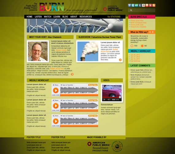
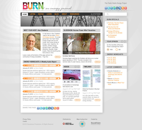
I fleshed out the basic site with their existing text and imagery, and on very short notice we put the early navigation and information hierarchy in front of a professional focus group. The reaction was very positive, and we implemented important feedback into the final aesthetic, identity and navigation.




2. aesthetic study
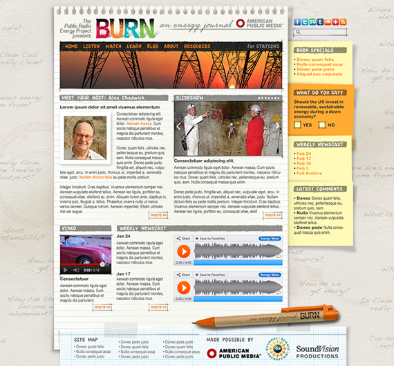
BURN: An Energy Journal was the vision and mission of master radio journalist Alex Chadwick, and I wanted to reflect his signature “personal narrative” storytelling sensibility with the BURN site. I played with visual metaphors of a reporter in the field: notebooks, paper textures, handwriting and coffee rings.
3. final grid
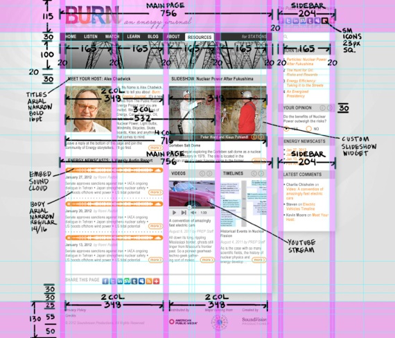
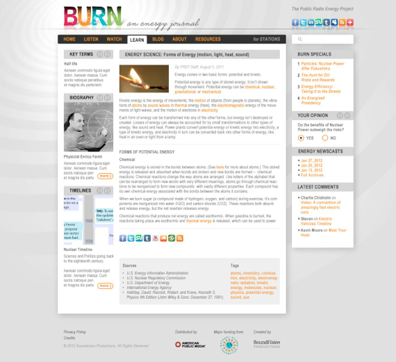
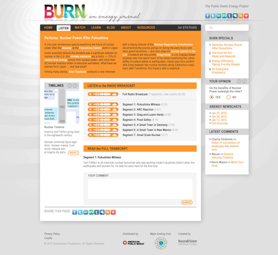
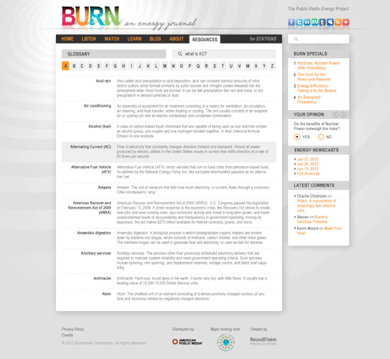
To-the-pixel architecture for the header, main menu, main page, sidebars, and footer, as well as specs for CSS type, embedded audio (SoundCloud), video (YouTube), graphics, a slideshow gallery, and a custom audio jukebox player.
4. final site
I built all design, layout, type, graphics, color, and slideshows in Photoshop. Most interactive elements are based on WordPress widgets and plug-ins and I generated a style guide to make those widgets comply with my design vision. For hard-code customization behind WordPress I hired and managing a team of 3rd party coders.
4. interactive elements
Hard-coded custom pop-up audio player is non-Flash so it works on iOS (iPod / iPad / iPhone). It’s completely independent of the rest of the BURN site and it intelligently swaps to whichever stream the user clicks, preventing multiple tracks from playing simultaneously. Users can listen to all of BURN’s SoundCloud streams while surfing the rest of the BURN site content.
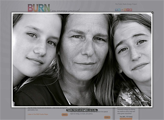
SoundVision collaborated with National Geographic photojournalist Lynn Johnson to produce some gallery-worthy images on a story about fracking. We built a pop-up slider widget to showcase her stunning black & white photos at full-screen resolution.
SoundVision coordinates with the University of Texas to curate an ongoing series of topical in-depth blogs from experts on energy science and policy. As each blog becomes available on BURN, we update a newspaper headline graphic in the sidebar which launches the latest issue.
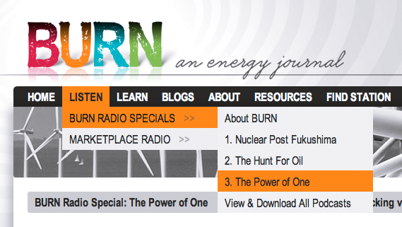
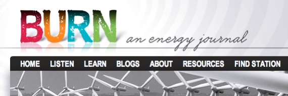
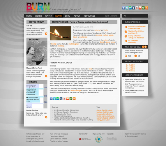
But we quickly agreed that stripping away layers of visual clutter resulted in a more professional presentation, giving the user a cleaner experience and letting the content have center stage.
Pushing for clarity and refining the visual focus on the raw content, I stripped out almost all color except for a consistent use of orange to signal a clickable element. I was very happy to let the colorful and distinctive BURN mark be the metaphorical ‘broadcast station’ at the top of the site, with stylized radio waves expanding into the background.

