communication design
to stop climate change
communication design
to stop climate change
{ design toolbox }


polarity
identity

recent work
1. logotype
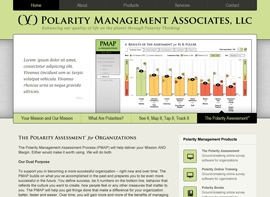
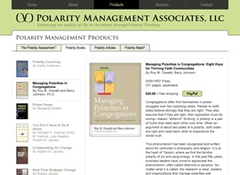
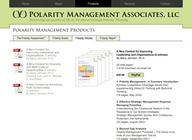
The extraordinary length of the full company name, Polarity Management Associates, LLC, offered a challenge right from the start. A small caps font with a visual simplicity and structure gave a solid footing without scattered ascenders and descenders. The full string of text might fit well along the masthead of a website, but it was illegibly small when scaled down to a standard business card. In fact, many referred to the company just as PMA, so my logotype needed to work as an acronym as well. I chose to use larger initial caps even in the full name as a subtle typographic bridge, hinting at the PMA nickname.
Meanwhile, since the Polarity Management Infinity Loop is the iconic cornerstone of the entire Polarity framework, I knew it needed to be tightly integrated into the PMA logotype. Choosing a font with a high stroke contrast helped me create a version of the infinity loop that perfectly matched the font style, even down to the arrow heads which mimic the font serifs.
The final logotype is very professional and traditional, but still crisp and clear. The minimalist rendering style, color palette, and elliptical bar keep it modern and adaptable to the variety of graphically intense software and website screens. And the seamlessly integrated infinity loop gives a pivot point around which the logotype can be arranged in several ways — long and horizontal, stacked, or abbreviated.


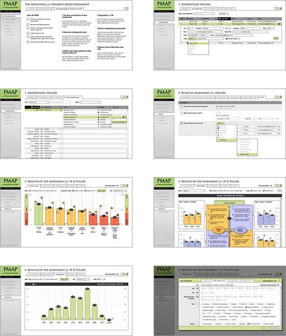
3. branding the pmap
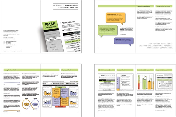



4. branding the brochure
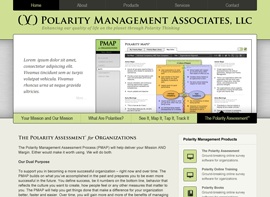
2. branding the website


5. alternate logo concept

