communication design
to stop climate change
communication design
to stop climate change
{ design toolbox }


pmap
ui + ux

recent work

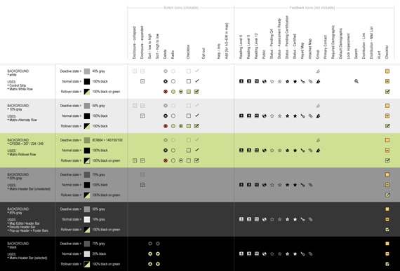


1. icons, buttons, menus
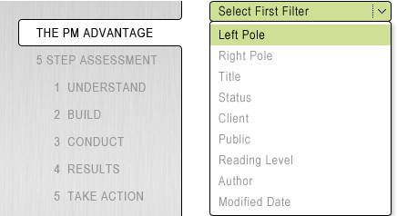
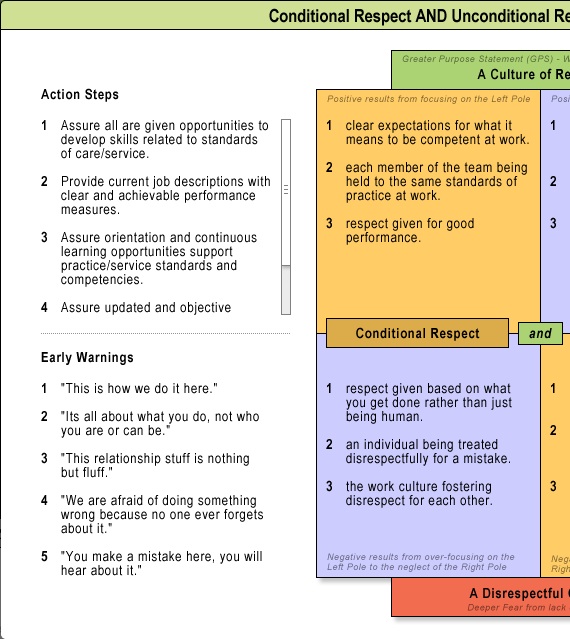
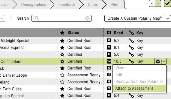
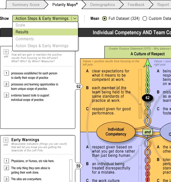
Among the favorite challenges for interface designers are icons and buttons. They are a language of their own, communicating maximum information in a minimum space. Complex software packages like the PMAP are the holy grail of UI because they require an entire suite of visual communication cues.
Just as spoken and written languages depend on grammatical rules, and fonts strictly maintain specific stroke characteristics across the alphabet, a really good palette of icons and buttons must introduce and strictly uphold a visual consistency: size, stroke, color palette, rendering style, informational hierarchy, and interactive states (deactive, normal, rollover) must all look and react predictably for the user to feel comfortable and in control.

The PMAP suite of 50 core icons, buttons and menus, implemented in all their various interactive states and on 6 different background colors resulted in almost 200 unique UI elements.
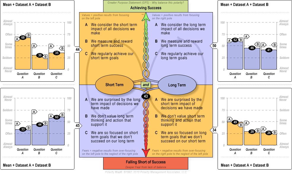


2. other ui + ux
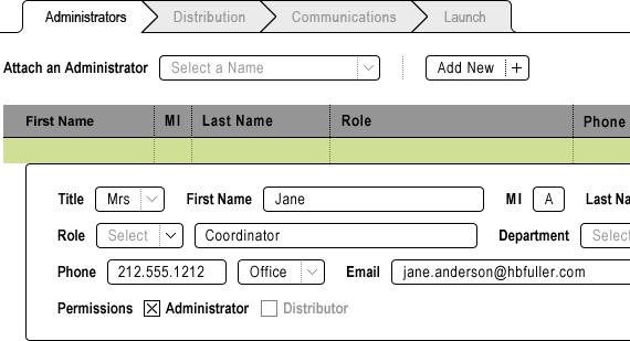
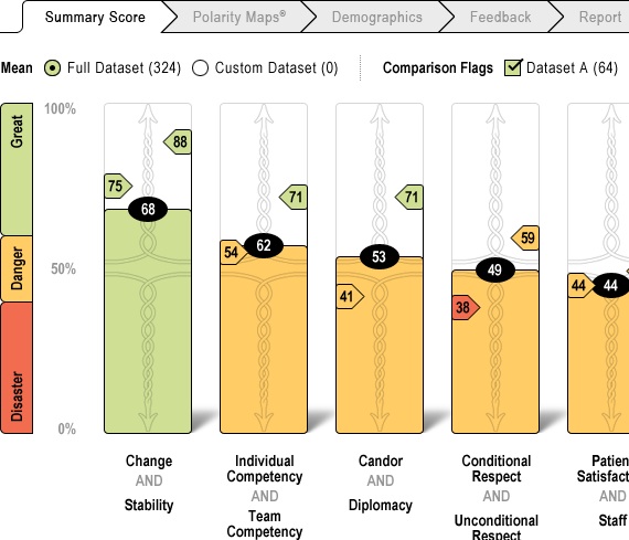
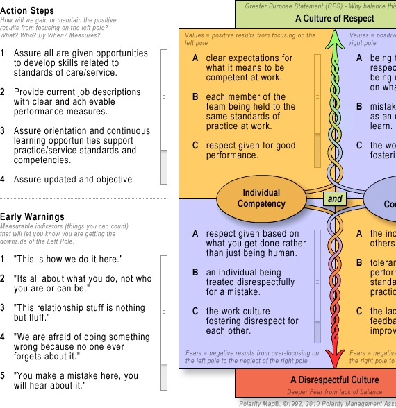
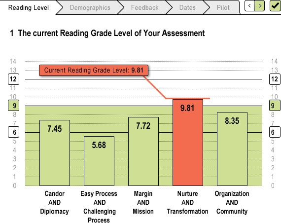
Throughout the PMAP are dozens of instances of design elements communicating complex data in useful ways: tabs, toggles, pull-downs, pop-ups, forms, matrices, sortable columns, and compound filtering. The PMAP was one of the most complex design challenges I have ever conquered — and I am very proud of it.
