communication design
to stop climate change
communication design
to stop climate change
{ design toolbox }


zenify
final

recent work


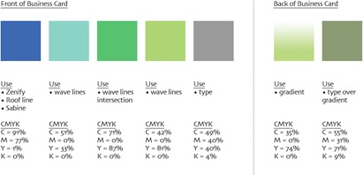
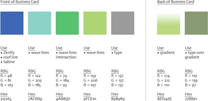
2. palette in hex, rgb + cmyk

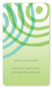


1. final logo
The final logo riffs on a font, but is completely re-proportioned and hand drawn with an artistically rough edge. The 3 solid hues have a flat print-like feel, and the tinted overlap of the two radial wave patterns subtly implies “interference”.
The extensive logo evolution paid off. For a logo, the visual narrative is incredibly complete: Zenify clears your space and shields you from unwanted electromagnetic interference.
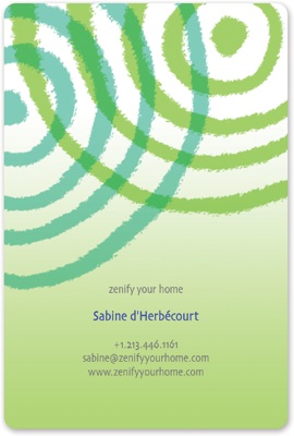
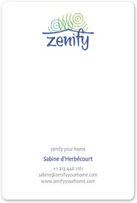
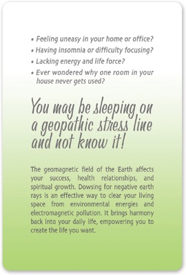
3. business card, letterhead, postcard, thank you card
A high-touch stock, matte finish, and rounded corners add warmth and personality to the brand.
4. website
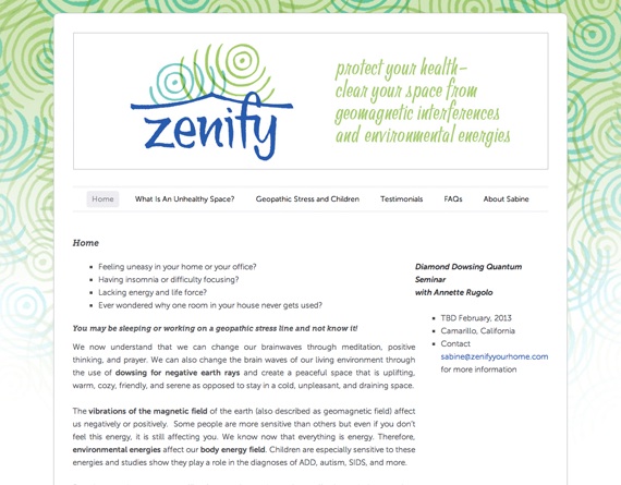
In a relatively quick pass through Zenify’s WordPress theme, I inserted the new radio wave pattern as a background and the new logotype and stylized subtext in the masthead, customized the grid on the home page, insert links and merchandise in the right sidebar, and cleaned up Sabine’s typography and color palette throughout.

