communication design
to stop climate change
communication design
to stop climate change
{ design toolbox }


dafa + dfsg
development

recent work



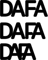


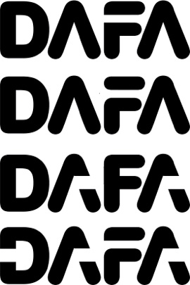
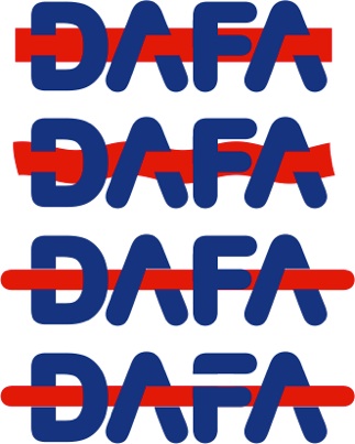
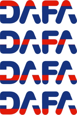
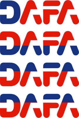







1. research
Design doesn’t happen in a vacuum. Countless great marks have already been developed on the backs of enormous investment of money and talent, so there is always something to be gleaned from a quick look around. Even when designing a completely original logo there’s no reason to completely reinvent the wheel. I quickly recalled several high-end marks which feature the letter A among 4 capital letters.
Keying off the word “Domestic”, and learning that some of the alternative fuels are crop-based,
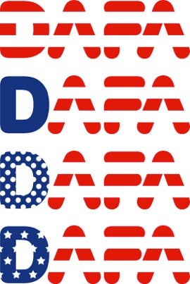
I anticipated some potential to reference “flags” and “fields”. I also had a sense that the client would benefit from a mark that presented them as patriotic instead of confrontational, so “stars and stripes” were on the table, too.
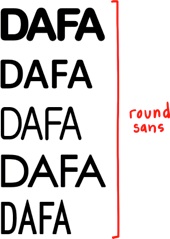
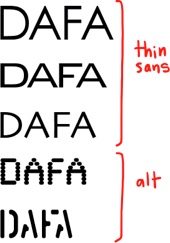
2. font search
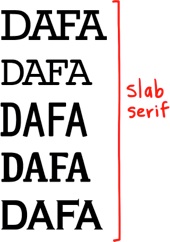
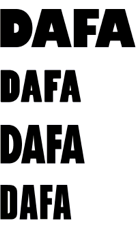
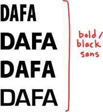
Searching for inspiration in the letter shapes.
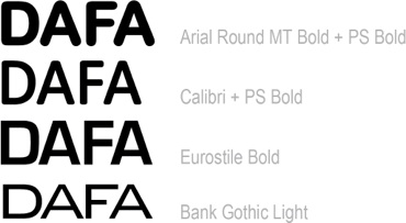
3. font crit
The fonts with the most natural and aesthetic lettershape fit for the DAFA characters.
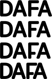
4. kerning + negative space
Reducing the tension between the letters, searching for simplicity and inspiration — like a common middle bar height between the two As and the F. Checking volumes of negative space.
5. customization
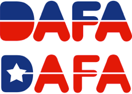
A strong silhouette is critical — with a good one, everything else is easy. But a poor letter volume will fight everything else. So is there a way to ‘connect the dots’ between these letters, without feeling forced? How much can be stripped away and still be easily legible? Could the bar between the As and F imply a connection ... an alliance? Or could it represent a pipeline, or a fuel flow from the “Domestic” D?
6. color breaks, stars + stripes
With the basic silhouette secure, can a color breaks solidify the concept of a pipeline / energy flow / alliance ? Or does it just add more clutter?
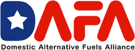
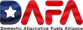
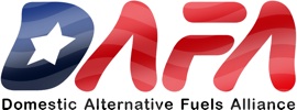
The full Domestic Alternative Fuels Alliance is a mouthful. Can we use color to emphasize the Domestic, leaving the Alternative Fuels Alliance as a more digestible piece? Bonus: the blue star field on the American flag is on the left, so simply coloring the D blue starts to imply patriotism.
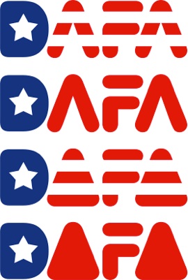
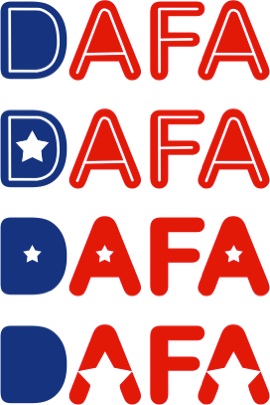
The “stars and stripes” feel too literal, too Evel Kenevil. But a single star does the job — and used as the counter, it retains the relative stroke weight of the original.
7. subtext
No one knows DAFA so spelling out the acronym is a requirement. Which placement is cleanest: below, left or right? Which keeps the letters as legible as possible at the smallest scale?
8. rendering
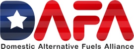
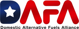
The letter shapes, kerning, volumes, negative space, customization, and subtext all work in black + white silhouette and with color breaks. But it’s very flat, very ‘old school’, very — with deep respect — Saul Bass. At the risk of cheesing up the strength and simplicity, I suspected my client needed a little sizzle for their pitch to hit home.
9. green the mark?
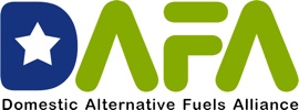
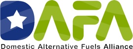
If we’re pitching “alternative fuels”, perhaps it’s better to join the brandwagon and go green? Happily, the blue D can be retained — but the flag ripples through the blue + green now imply water and fields! This was my favorite — but not the client’s.
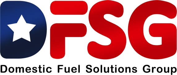
10. name change + final
Standing at the finish line, we had a name change. Luckily, all the development work applied easily and very little nudging was needed to give the client a final mark they loved.
