TECHNICAL: Alex & Emma Titles
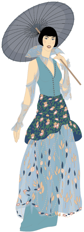
Motion design boutique Citoyen contracted me to create highly detailed and artistic illustrations matching stylized art from the 1920’s for the opening titles of Rob Reiner’s feature film Alex & Emma.


I loved working with Citoyen, and their idea of pushing through stylized illustrations was really cool.
But I anticipated their motion designer was going to render the layers of my drawings with depth-of-field blurring or parallax motion. Perhaps time and budget didn’t allow it, but unfortunately the final motion ended up feeling stiff and stilted to me.
I also confess that this is the “Illustrator’s Cut”: I found the original to be laboriously slow so I literally doubled the playback speed, and I completely axed a brief frame animation sight-gag at the very end which was so poorly done it undermined everything else.
Still, it was a moment of deep pride for me the first time I saw my drawings up on the silver screen.
See more projects that use these skills …


