IDENTITY: KRON 4
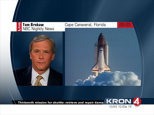
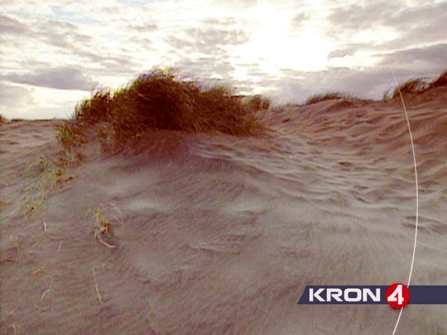
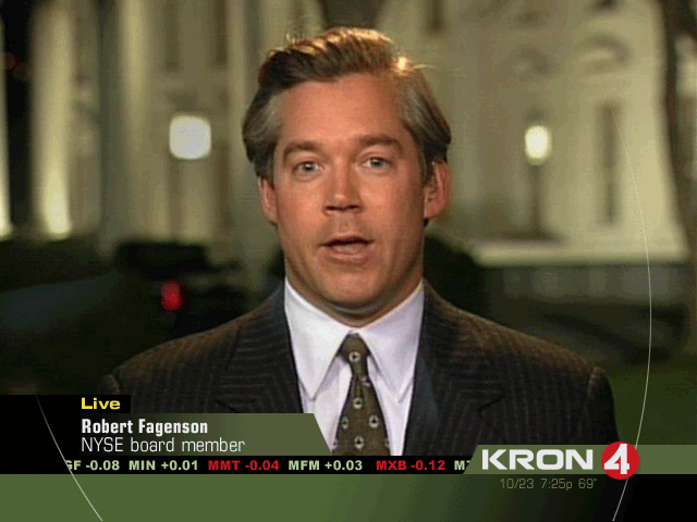
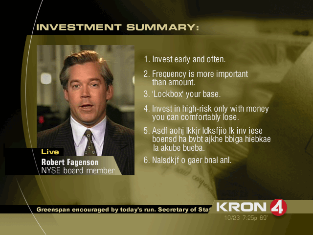
Linda Kane Design hired me to help create the logo, graphic identity and show package for San Francisco’s KRON 4 NEWS.
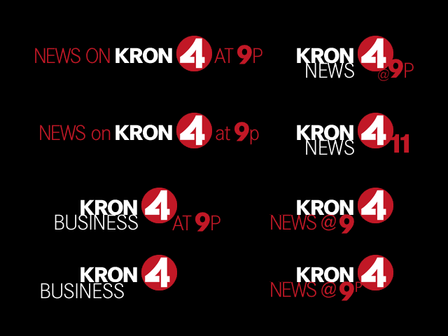
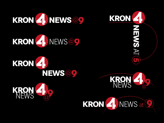
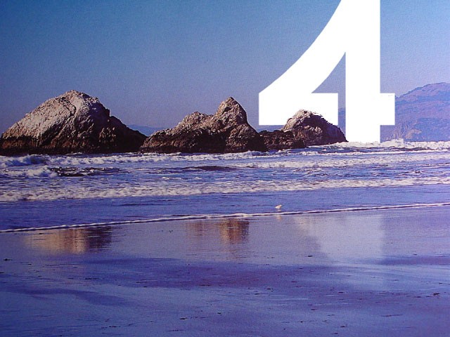
The font search centered around finding a clean but distinct number 4, then developing a typographic treatment around that focal point which would be flexible enough to accommodate the branding of all KRON’s various news programs.
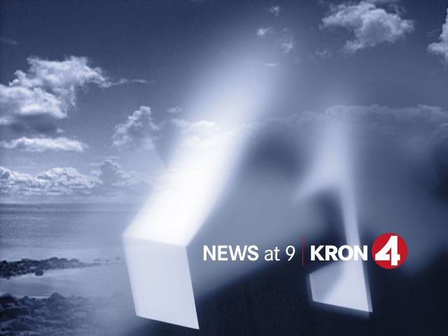
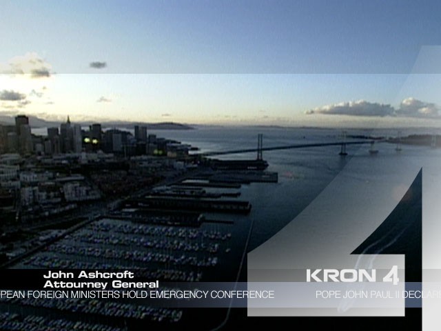
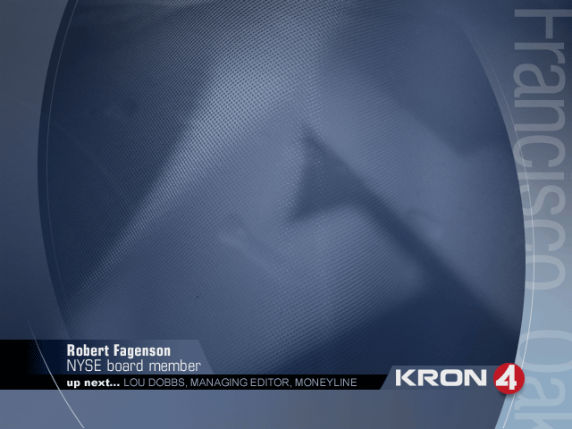
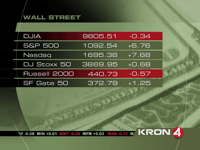
Next was creating the larger show package, taking it’s cues from defining elements in the new logotype, and integrating the logotype into the various show segments: title cards, lower thirds, video windows, split screens, business graphics, data, tech, stocks, sports, etc.
See more projects that use these skills …
