PACKAGE: Salad Sisters
Salad Sisters hired me for illustration, type, and package design as they launched their gourmet dressing line to Canadian and U.S. markets.
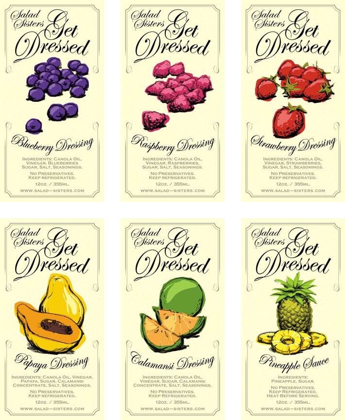
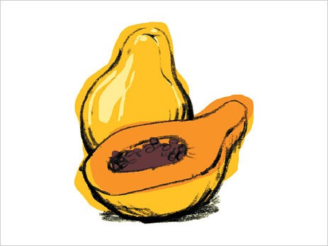
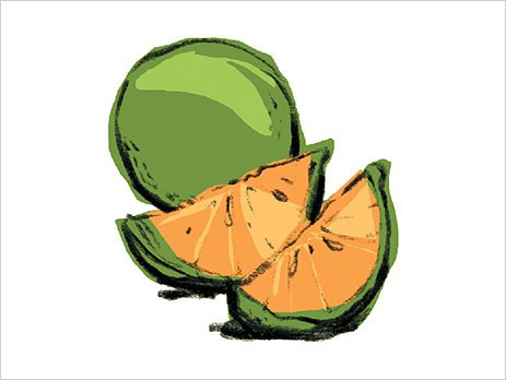
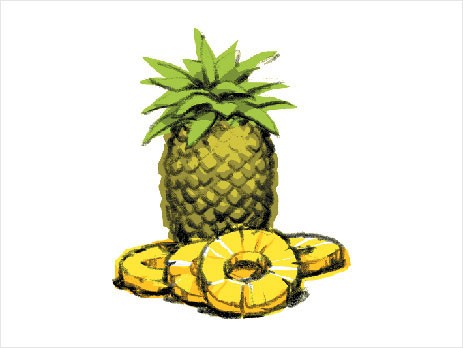
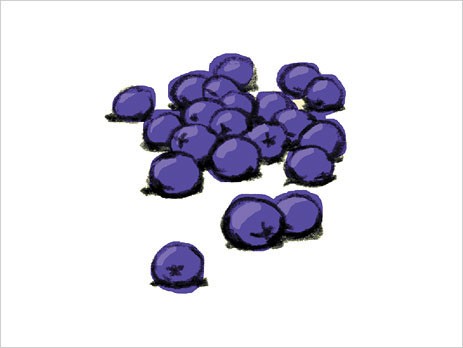
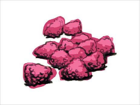
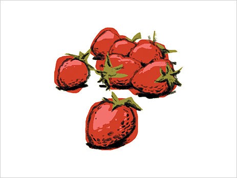
The hand-drawn china marker line and flat serigraph-like color made these some of my favorite client illustrations.
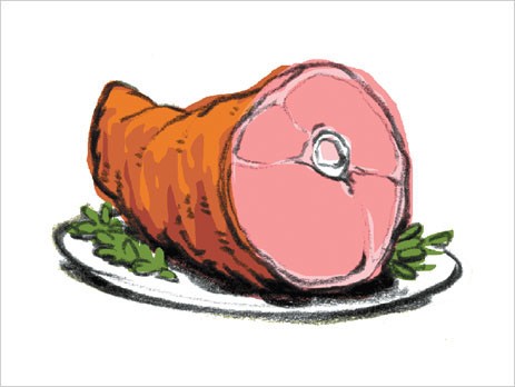
Yes, there is a ham on the last slide! And yes, it was a real flavor until it was pulled from the lineup for being … ham ; )
below: front and neck labels mocked up on bottles


See more projects that use these skills …


