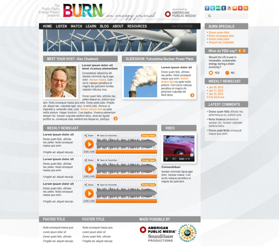
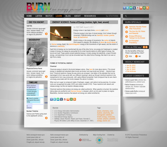
WEB: BURN

I’m especially proud of the BURN website.
The design and development of this rich media portal drew on the full breadth of my skills — logo + identity, UI + UX, graphic + web design, digital illustration, lots of tech + media challenges, and my love of science + education applied to sustainability.

On the Evolution of Awesome
I’m a prolific creator, but I also know that aesthetic magic is sometimes discovered as much as conceived. So I take pride in being a highly iterative designer, and my clients benefit from the volume and variety of my process.
Early in development I sketched a logotype that integrated with a series of energy icons. I proposed the colorful glyphs would both introduce the audience to the breadth of the show’s topics, and provided a color-and-icon key that could be referenced throughout the site.
![]()
I also played with a logotype + UI build in Flash, teasing the question, “BURN what?”
Once the logo resolved, the user could click on an icon to select topics related to that energy sector.
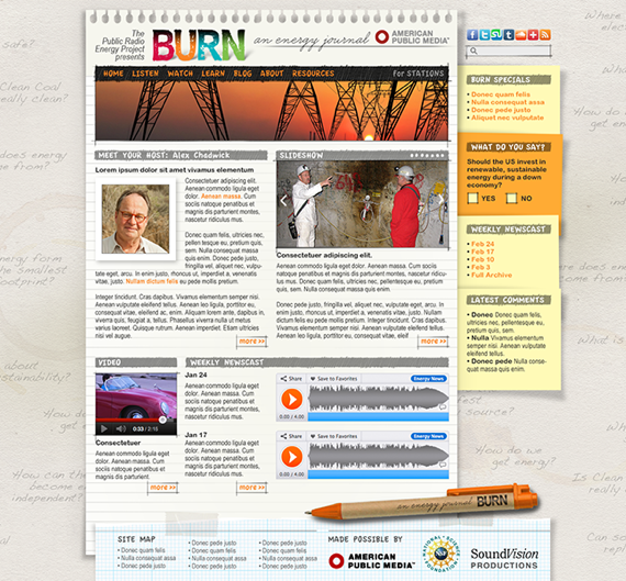
Do notebooks, scratch pads, and ballpoint pen connote the traveling journalist?
Isn’t skeuomorphism dead?
Is BURN a ‘green’ media project? Are these stories advocating for sustainability?
Isn’t this green treatment too heavy handed?
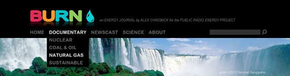
The four BURN spot colors really pop against a darker header.
Can we use those same colors as accents throughout?
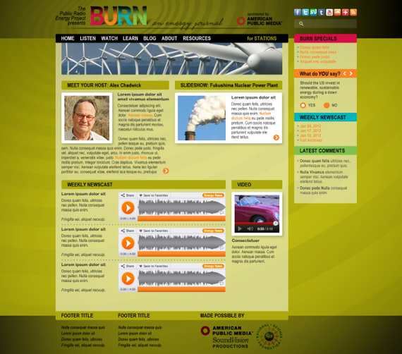
Time to dial it back.
Turn down the contrast of the background and accent colors to let the eye focus on the media content.
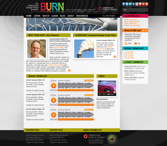
Getting close.
Stir in the best flavors from various sketches, taste, add something, repeat. It’s experimental cooking, and it’s not right ’till it’s right…
See more BURN design work.
See more projects that use these skills …